Plotting Options
On the Plot View, each datum is an unconnected dot (or, in the case of blood pressure data, an unconnected pair of connected dots).


To make sense of this data, Morning Sugar draws lines which represent different ways of interpreting these data points. These lines can be categorized into three general groups:
- Averages
- Running Averages (or trends)
- Smoothing
There are number of options available. Which ones are relevant to a particular type of data depends on how often you collect it. For example, suppose you measure your weight weekly. A weekly average would only contain one data point, and wouldn't tell you anything particularly interesting. On the other hand, a monthly or quarterly average might be quite useful.
As a general rule, more points are better. A weekly average, for example, should ideally contain at least 4 points, so it may be an appropriate metric for daily data. A monthly average may be an appropriate metric for either daily or weekly data, etc.
The Legend
As mentioned above, there are lots of plotting options to choose from, but only some of them will be relevant to your data. As part of the customization process (see Customizing) you get to choose which plotting options you want to consider. These are the options that will be listed in the plot Legend. The Legend lets you choose which options to actually display on the plot.
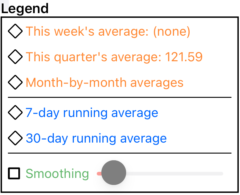
You can choose to display one curve from the ‘average’ section, one from the ‘running average’ and/or one from the ‘smoothing’ section. (The text color in the legend is mirrored in the color of the curve on the graph.)
The diamond icons represent a special flavor of radio button. If you tap an unselected item, it becomes the sole selection in its group (like a standard radio button), but if you tap a selected item, it deselects (like a checkbox). That is, you can select none or one option in each group.
NOTE: when displaying blood pressure (or other dual-valued data), Morning Sugar calculates and displays curves for the two values independently.
Averages
Averages fall into two categories: current averages and month-to-month averages.
Current Averages
Current averages are calculated by averaging the points in the current time period, then drawing a line on the plot showing that value.
- A weekly average includes all of the points in the most recent 7 days.
- A monthly average includes all of the points in the most recent 30 days.
- A quarterly average includes all of the points in the most recent 90 days.
- A yearly average includes all of the points in the most recent 365 days.
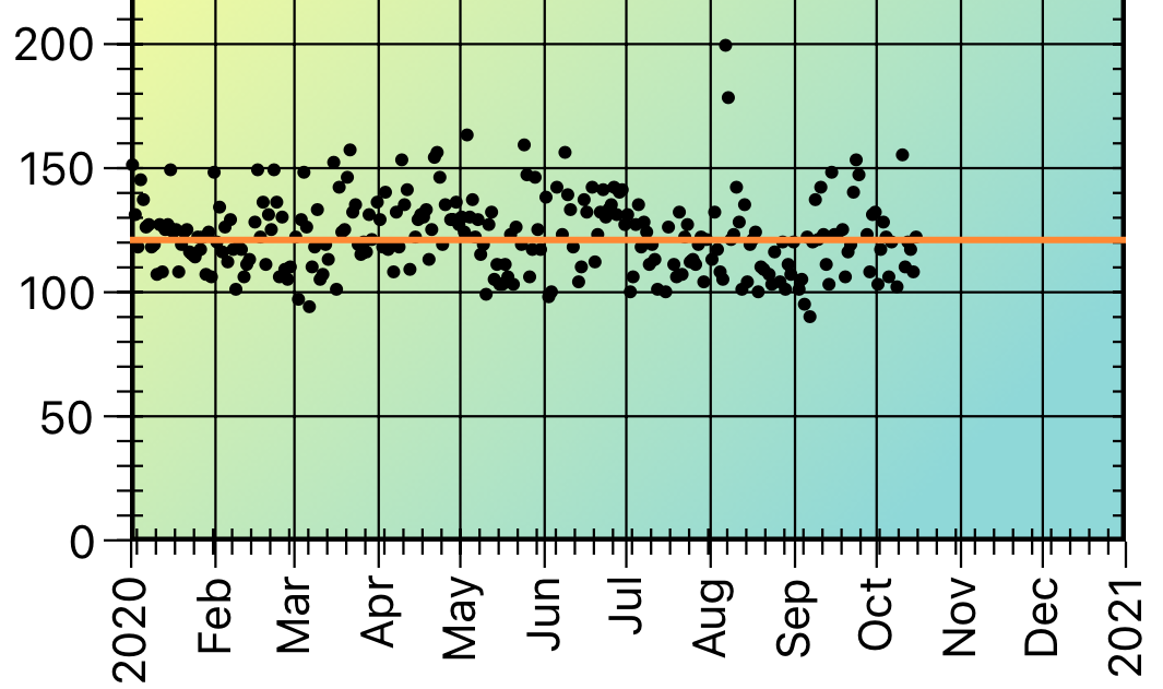
Quarterly Average
Month by Month Average
A month-by-month average is calculated by dividing the displayed time period into months and calculating the data average within each month. The result is drawn as a set of month-long line segments. (Obviously, this metric is only useful for daily and weekly data.)
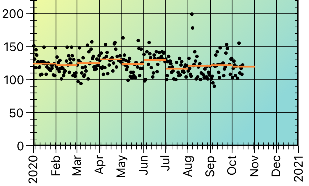
Month by Month Average
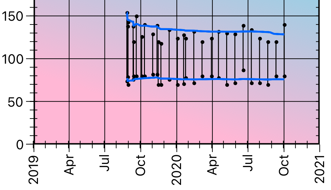
Running Averages
A running average is a way of showing the pattern of the data. A n-day running average is calculated (at each data point) by collecting all of the data points which were collected on the date of the data point and the (n - 1) days prior.
Suppose you are collecting your weight every day. Then to calculate a 7-day running average, for each day we calculate the average of that day's weight and the preceeding 6 days weights. That creates a sequence of running average values. We then draw a line that connects each of the calculated points (using a quadratic bezier curve between values).
Notice the difference between the 7-day and 30-day running averages of this data. This demonstrates that you need to think carefully when interpreting your data.
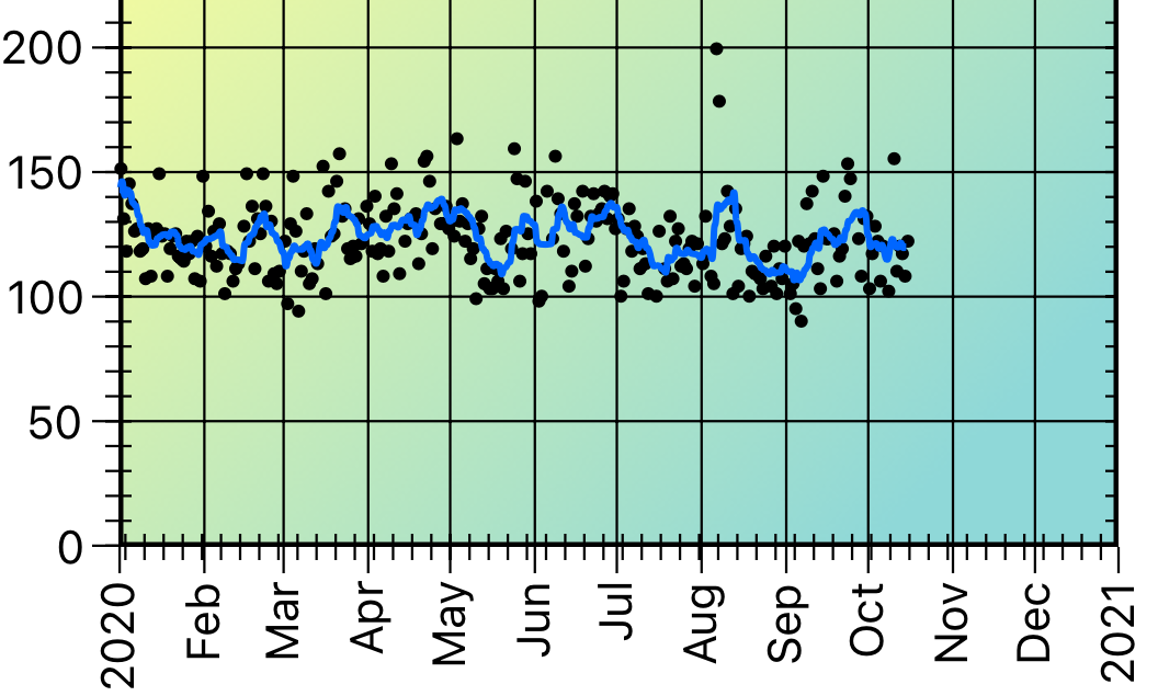
7-Day Running Average
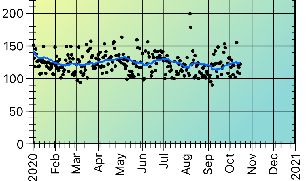
30-Day Running Average
Morning Sugar provides options for 7-, 30-, 90-, and 365-day running averages.
Exponential Smoothing
To quote Wikipedia,
Exponential smoothing is a rule of thumb technique for smoothing time series data using the exponential window function. Whereas in the simple moving average the past observations are weighted equally, exponential functions are used to assign exponentially decreasing weights over time. … Exponential smoothing is often used for analysis of time-series data.
Basically, what that means is that we calculate a smoothed representation of the data at a particular point in time by weighting the value with a contribution from the previous data.
We use simple exponential smoothing, which is described by
st = αxt+(1 – α)st-1
That is, the smoothed value at time t is the sum of a fraction of the data value at time t and a fraction of the previous smoothed value. The fraction value α is called the smoothing factor. (Obviously, the smoothing factor can range from 0 to 1.)
There is no analytical way to determine what the “right” value is for the smoothing faction; it is an adjustable parameter, and Morning Sugar lets you adjust it as you wish.
Compare these two plots which show the effect of a low and a high smoothing factor.

Low Value of Smoothing Factor

High Value of Smoothing Factor
When the smoothing factor is small, previous data make a more significant contribution to the result; when the smoothing factor is large, the current data point makes a more significant contribution.
As with the running averages, we draw the exponential smoothed curve using a quadratic Bezier curve between data points.